Agora
"Shipped" product. UX & Ul Design for Agora, a multi-platform application to help our users better manage their digital lives.


Context

Partnership
Previously worked together, a designer and a developer. We both love designing products.
Personal needs
We installed many apps on our phones, use many digital services, it’s cumbersome to manage different apps and services, can we just make it simple somehow?
Industry Trends / External Factors
Widget support since iOS 14 and macOS Big Sur
The popularity of New tab in Browser extensions increased
Initial Design Direction Emerged
Design & build a virtual product to help people better navigate through their digital lives.
The Start of Something New
Our journey started with a simple question: How can we make managing digital tools easier for everyone? With so many apps and services out there, we wanted to create a single place where users could bring their digital lives together. That's how Agora came to be - a dream of a multi-platform application designed for better digital management.
Duration
Dec 2020 ~ Present
My Role
Product Designer, Project Manager
Platform
Mobile App (iOS-based), Web App
Colleagues
Solo Designer, 2 Developers
Insights and Opportunities
Key Takeaways from Research
The design direction is solid/doable.
The need for customization is more desirable than the need for productivity, but they are not in conflict with each other.
We should find a balance between the features we’ll provide and the development cost, and aim for higher ROI.
Reduce Opportunity Areas
Virtual Hub/Dashboard
Improve power users’ productivity
Offer average users simple customizations
Target Audience
Not only Power Users
Users who want to customize their Home Screens
Users who care about productivity
Product Scope
Multiple Platform Support: mobile (iPhone & iPad), Desktop
Essential Productivity enhancement
Light Customization options
Business Strategy
Pricing
Quickly Release MVP to validate our product
How Might WeEmpower users' digital lives by improving their productivity
and offering customizations on their digital devices?
Designing and Prototyping Agora
Through the design process, we focused on creating a virtual hub that balanced productivity enhancements with light customization options. Our prototype featured widgets with essential information and options for users to personalize their digital space. We iterated on the design based on early feedback, aiming to create a user-friendly and valuable tool.
Special Focus: What our competitors were not doing well? And in which ways could we improve?
Showing Everything vs Focusing on the “Essential Information”
What digital information did users use most often?
Calling for Attention vs “Come Here Whenever You Want”
We didn’t want users to click into our app if they didn’t need to. With the new widgets feature introduced in iOS14, that was perfect for our use cases.
Small & Medium widget: 3 components maximum Large widget: 4~6 components
Connecting Every Service vs Everyday Services
Which apps/services could we connect with? Calendar, Reminder, Notes, etc.. just everyday services
Core Concepts
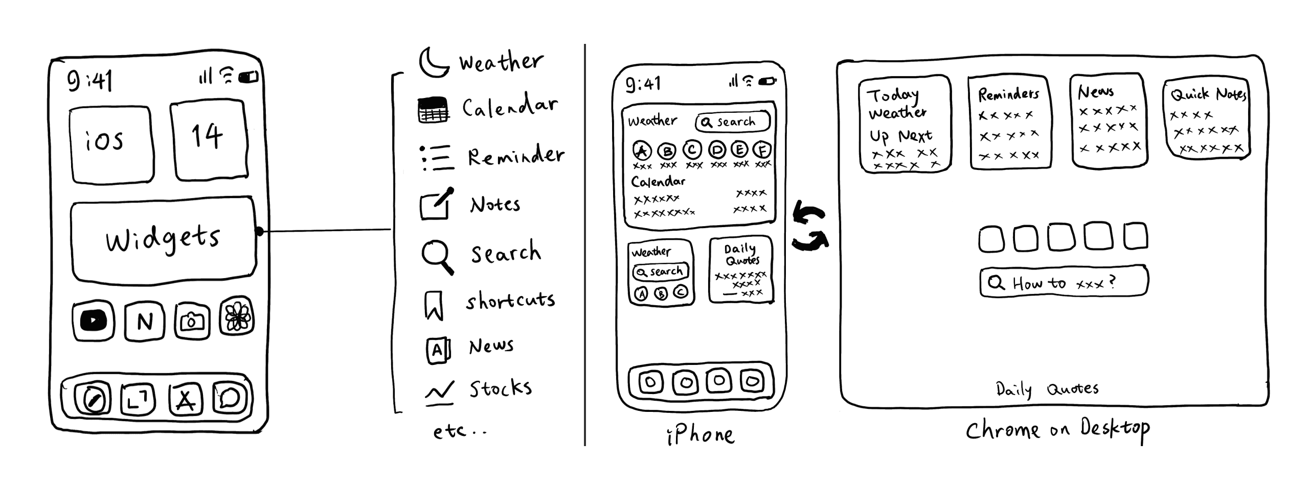
Widget with essential information

Desktop version

Mobile version

Facing the Challenges
Our journey wasn’t without obstacles. The biggest challenge was realizing we couldn’t finish some key features in time. This meant we couldn’t launch Agora on the App Store as planned. Instead, we used TestFlight for beta testing, allowing us to gather feedback from a smaller group of users.

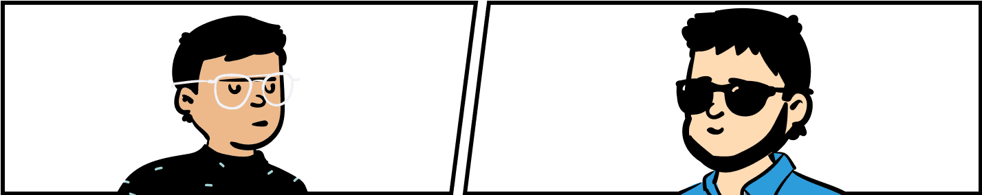
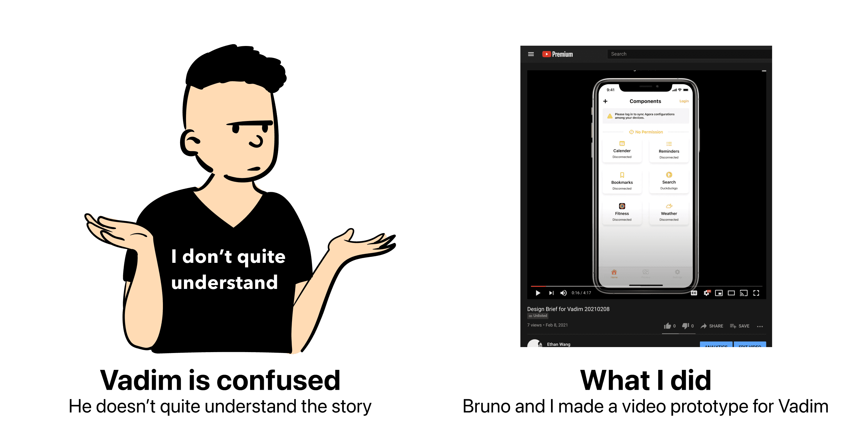
Collaboration also posed its challenges, especially when introducing a new iOS developer to the team. Our main coder, Bruno, was unsure about sharing too much design information, which initially left our new teammate, Vadim, in the dark about our vision. To overcome this, we created a video prototype demonstrating Agora’s concept and interactions, which helped everyone get on the same page.

Outcome / Prototype
Beta testing version for both mobile and desktop platforms released.
For me, the biggest fulfillment of design is when people actually use my design and appreciate it.
During our beta testing, one user said this:
“I’ve been using it daily and ignoring the bugs and layout issues, I actually find it quite useful”
That made my day.
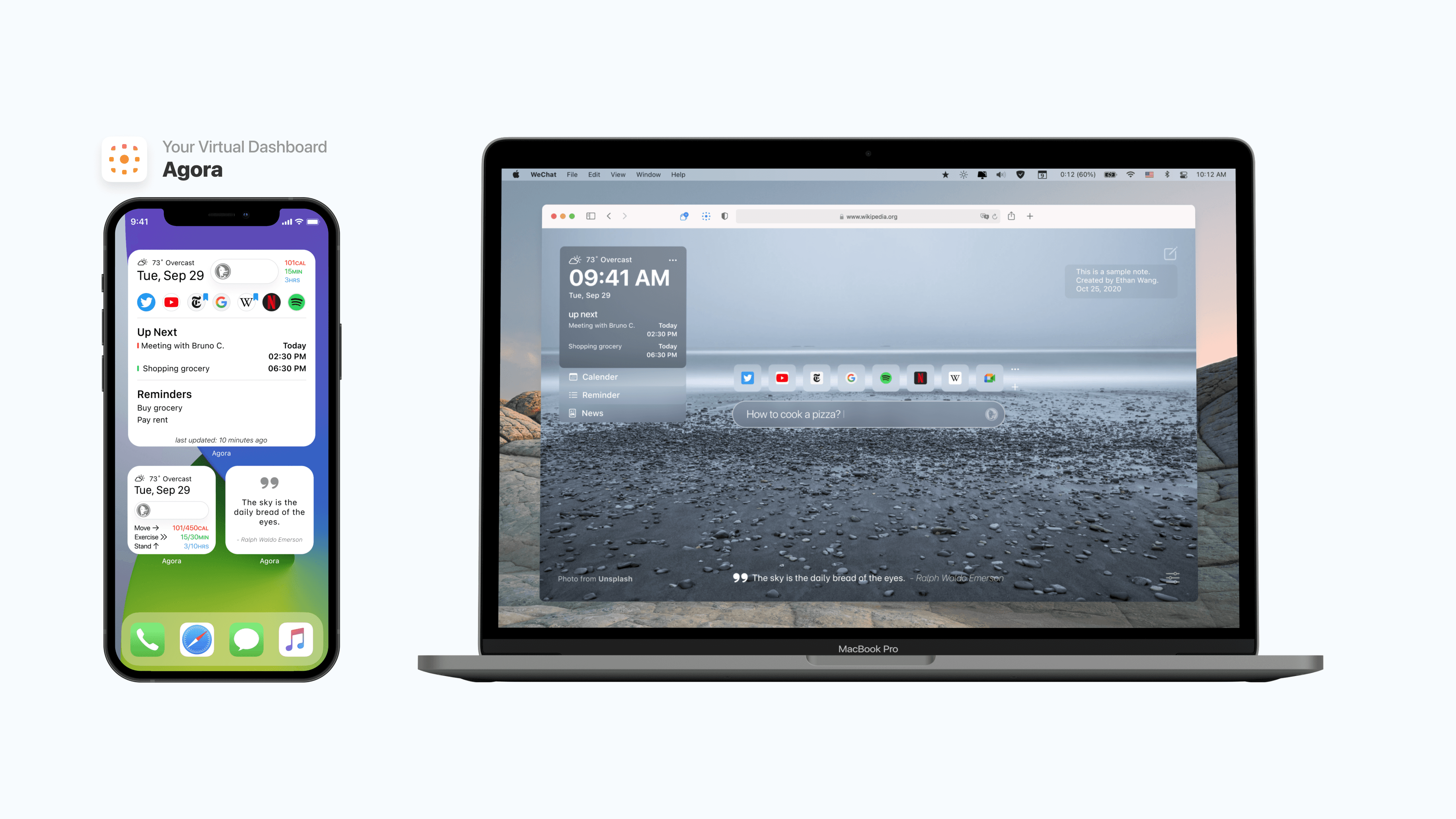
Mobile app screenshots

Desktop app screenshots

Desktop prototype preview
For the ideal visual experience, please use the Figma link below:
https://www.figma.com/proto/9kCPwq
What I Learned
Despite Agora not making it to the App Store, the project was far from a failure. I learned invaluable lessons about project management, user research, and the importance of clear communication within a team. The feedback from our TestFlight users, particularly the positive impact Agora had on their digital management, was incredibly rewarding.
Project Management
Asynchronous Collaboration
UI guidelines / components
etc...
Double Diamond / Linear Process Critique
! To be replaced with a new process diagram

I use the double diamond diagram to guide my design process, it works pretty well in this project. But Design is not a linear process, it's jumping back and forth to define problems and refine solutions.
Looking Back and Ahead
The Agora project was a testament to the power of design thinking and the resilience required to navigate the ups and downs of product development. It taught me that every challenge is an opportunity for growth and that user feedback is crucial for refining my designs.
The End?
We’re not working on Agora right now, but who knows? Maybe in the future, we’ll pick it up again. For now, I’m proud of what we did and excited to use what I learned in my next project.
Have you faced similar challenges in your projects? I’d love to hear about your experiences and how you navigated them!